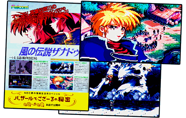
Showcasing truly beautiful in-game character art, The Legend of Xanadu Poster #1 (1300x1636 .jpg) ▼ was the first installment in a series of at least six distinct advertisements over the next eight months. Now, although the in-game screenshots were certainly beautiful, the overall layout of the advertisement itself was typical and unremarkable. Don't worry, someone at NEC recognized that a high-profile game like The Legend of Xanadu required a grander, more sophisticated marketing campaign than what you see below…

WAIT! THERE ARE MORE…
The Legend of Xanadu Poster #1. SOURCE: Gekkan PCE (1993 August)
The Legend of Xanadu Poster #2. SOURCE: Gekkan PCE (1993 September)
The Legend of Xanadu Poster #3. SOURCE: Gekkan PCE (1993 October)
The Legend of Xanadu Poster #4. SOURCE: Gekkan PCE (1993 November)
The Legend of Xanadu Poster #5. SOURCE: Gekkan PCE (1994 January)
The Legend of Xanadu Poster #6. SOURCE: Gekkan PCE (1994 March)
NO HATE MAIL: Now, before you call me foolish for criticizing the ad above as "unremarkable", let me explain—I am simply making a distinction between content and layout…and it is the layout that is unremarkable.
The content of the ad is actually quite nice, featuring (g)orgeous screenshots and in-game character art. Using the in-game character art reveals a level of confidence that was rare in advertising. Indeed, the typical modus operandi for marketers back in the 80's and 90's was to impress readers with lavish paintings/hand-drawn illustrations, sprinkling a few miniscule screenshots on top for good measure. Yet, here we have the in-game assets from The Legend of Xanadu, nice, big and fully ready to be scrutinized by the readers.

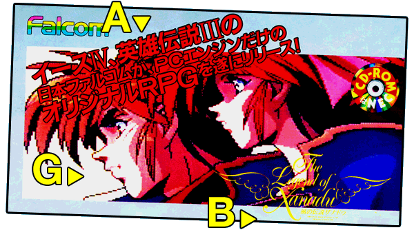
(G)ORGEOUS: Jumbo-sized screenshots of actual in-game art reveals how (g)ood-looking this game will be.
(A)BOMINABLE: The decision to place red text on a red background was (a)trocious.
(B)AFFLING: The (b)arely-discernable logo for The Legend of Xanadu used in the ad. Mind-(b)oggling.
GAB: In stark contrast to the (g)orgeous screenshots and in-game character art, the design choices and layout of the advertisement itself range from (a)bominable and (b)affling (explained above), to simply (u)tilitarian—all screenshots and text in the ad are arranged in an efficient, but typical, grid pattern. The utilitarian design is useful for communicating information, but however "nice" this ad may be, it is not sufficiently "epic" in its overall vision to capture the grand scope of The Legend of Xanadu. An epic game requires an epic advertising campaign to match it.
Continued below…
TOP TEN PLUS (VOL.3)…▲
Work in progress…

DETAIL: …
Note the…
▲
Return to top of page…