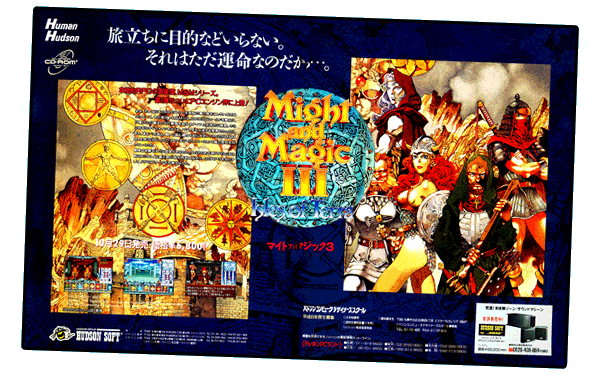
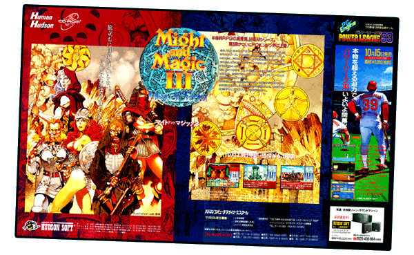
The truly gorgeous Might & Magic III–Isles of Terra Poster #1 (2600x1623 .jpg) ▼ and Might & Magic III–Isles of Terra Poster #2 (2600x1601 .jpg) ▼ below feature splendid illustrations by Akihiro Yamada…
SOURCE: Gekkan PCE, November 1993

SOURCE: Dengeki PCE, November 1993

HUDSON SOFT BY BOSE: With a premium price tag of ¥89,000, the BOSE PAM-4H subwoofer + satellite speaker system was a niche product targetted at PCE owners. Thankfully, you do not need to spend ¥89,000 to fully enjoy Might & Magic III's glorious soundtrack (.mp3 ▼).
AKIHIRO YAMADA: A manga artist, illustrator and character designer, Akihiro Yamada is credited with artwork/character design for several PCE ports…
01.24.1992 Might & Magic (CD)
10.29.1993 Might & Magic III: Isles of Terra (SCD)
07.23.1993 Wizardry I & II (SCD)
03.04.1994 Wizardry III & IV (SCD)
NOTE: Did Akihiro contribute to Wizardry V–Heart of the Maelstrom (SCD, 09.25.1992)? He certainly didn't do the cover art…
FANTASY ART: It is not surprising that Akihiro Yamada was chosen to contribute to these PCE titles, since he specializes in fantasy art. Although his career began in 1981, what professional work helped him establish himself in the genre of fantasy? His work for Record of Lodoss War: The Lady of Pharis (he illustrated two volumes of the 1995 manga), for example, came years after his PCE projects…
Continued below…
MENDING MIGHT & MAGIC III—ISLES OF TERRA POSTER…▲
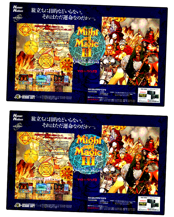
In the image below, I had successfully eliminated the vertical seam that ran down the center of the poster (the navy blue background)—but I had been unable to salvage the Might & Magic III logo (too much original text was lost in the centerfold when it was scanned)…

SAVED FOR POSTERITY: Click the image above to see the original, ugly version of the poster. I was going to delete it, but I decided to keep it—as a reminder that fixing things is worthwhile.
CLOSE, BUT NOT QUITE: Sometimes, a single flawed item can completely ruin an entire composition. The original Might & Magic III logo was the focal point of the poster, guaranteeing that viewers would immediately see the distorted text being sucked into the blackhole of a centerfold. I tweaked the logo, trying to minimize its problems, but I did not have enough material to work with.
THEN I REMEMBERED that a Might & Magic III logo could be salvaged from a nearly identical advertisement in the September 1993 issue of Dengeki PC Engine. After cropping the new logo and fixing it up, I was able to dump it on top of the old logo. Purists might not be happy with the slight alterations I made (the logo now overlaps the dwarf's face), but it was a compromise that improved the overall composition.
TOP TEN PLUS (VOL.6)…▲
Work in progress…

DETAIL: …
Note the…
▲
Return to top of page…