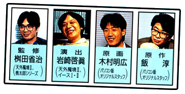
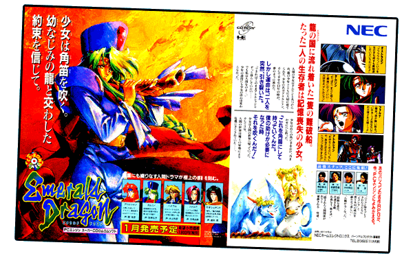
 The Emerald Dragon Poster #2 (2600x1630 .jpg) ▼ below proudly promotes the cast of voice actors who bring the story of Emerald Dragon to life with extensive cinemas and in-game voice-overs. Since Emerald Dragon was available on several capable platforms (NEC's PC-98, Sharp's X68000, MSX, Super Famicom), the PCE port distinguishes itself by the extensive voice acting incorporated throughout the entire game.
Voice-overs accompany many of the in-game dialogue boxes, especially during poignant moments in the story, adding a rich layer of immersion to the story beyond the cinemas themselves (in fact, in-game voice-overs stengthen the cohesion between the cinemas and the game proper).
ASIDE: In terms of cinemas and voice-overs, the only port of Emerald Dragon that seems comparable to the PCE experience is the FM-Towns version. Until I play the FM-Towns version, though, I can't make any meaningful comparisons between them.

Emerald Dragon Poster #2. SOURCE: Gekkan PCE (1993 December)
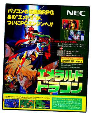
Although Emerald Dragon Poster #1 (1300x1640 .jpg) ▼ below also promotes the extensive voice acting and cinema scenes found in the game, it lacks any photographs of the cast (their acting credits from other PCE games are listed, though). Eschewing the unique, dinstinctive artwork of the other two advertisements, however, the presentation of Poster #1 is decidely more generic (a collage of characters in conventional poses, manga-style). Even the title of the game is in cookie-cutter, metallic-green kanji! This logo lacks any personality and is slick/glossy enough for a racing game. Poster #2 and #3, in contrast, wisely use the quirky English-language Emerald Dragon logo with its highly stylized font.


Emerald Dragon Poster #1. SOURCE: Gekkan PCE (1993 November)
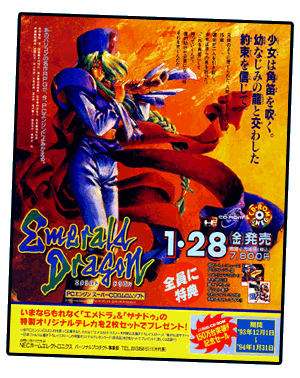
Emerald Dragon Poster #3. SOURCE: Gekkan PCE (1994 February)
LOGO/TITLE: (1) Generic, metallic-green kanji VS. (3) Quirky, stylized font/logo.
COMPOSITION: (1) Collage of nicely drawn manga-style characters, striking conventional poses VS. (3) Somber, dramatic painting of lone character.
Finally, Emerald Dragon Poster #3 (1300x1625 .jpg) ▼—with Tamryn's endless red sash billowing in the wind—provides the most striking imagery…it's not that Poster #1 is bad (it's actually quite nice), it's simply that Poster #2 and Poster #3 are, aesthetically, in a league of their own—the brooding image of Tamryn holding the broken dragon horn makes an emotional connection with the viewer that the character art (manga-style) used in Poster #1 fails to achieve. CHOOSE ONE: Initially, I felt that Poster #2 was the clear winner (and it probably is, using conventional criteria to judge them). However, ultimately, Poster #3 is the best of the lot, in my opinion, because the visual message is simple and focused. Posters #1 and #2 are too busy, desperately displaying as many elements as possible. Notice that Poster #3 doesn't attempt to display a slew of characters from the game, or offer even a single screenshot—it doesn't need to, since the non-cropped painting of Tamryn is far more effective at capturing the viewer's imagination. Sadly, all three advertisements are overly cluttered with text/sidebars/etc.
Continued below…
TOP TEN PLUS (VOL.7)…▲
Work in progress…

DETAIL: …
Note the…
▲
Return to top of page…