If you do not find the screen resolution that you need (including mobile devices), simply contact us and we will add it to the list.
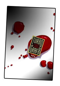
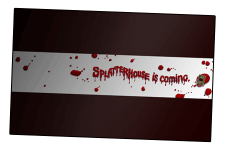
Click on any link above to view image in your browser…
 Saving to iPhone / iPod Touch (320 x 480)▲
DIRECTIONS: Press and hold your finger on any image (320x480 is best). A menu will appear with the option to "Save Image". Next, open the PHOTOS application and look in the "Camera Roll" (iPhone) or "Saved Photos" (iPod) folder to find the image you just saved. On the menu bar at the bottom of the screen, tap the icon on the far-left and select "Use As Wallpaper". Done.
▲
FRIDAY THE 13TH
A few weeks ago, on the way to work, I noticed some posters promoting the release of the latest film in the tired Friday the 13th series. It seemed as if half of the telephone booths and busstops in Manhattan were adorned with Mr. Voorhees. "How odd," I thought, "this poster is pretty bland, even though Jason is prominently featured in it. Surely a more effective campaign could have been used?"
Of course, a campaign could not be too gruesome, because these posters were in plain sight of everyone, including children. It was at this point that I started thinking about NEC's advertisements for Splatterhouse, and it struck me how effective a simple concept could be.
▲
DESKTOP VERSION
For the desktop wallpaper, I was going for a straight-forward, literal representation of the original Splatterhouse advertisement. Considering all of NEC's and TTi's marketing, this was certainly one of their more risque efforts. As I have discussed elsewhere, I think this advertisement has aged quite well:

Advertisement for Splatterhouse on TurboGrafx-16 (HuCARD, 1990)
Unfortunately, the original ad (with its clinical, ultra-brite, ultra-white, high-contrast, candy-red aesthetics) was far too harsh to become a practical desktop image. Instead, I wanted the desktop to feel dusty, dank, rusty, hazy and subdued.
I don't know if anyone will like the dirty-red color I chose for the desktop wallpaper, but it was derived from the TG-16 logo pictured in the ad. Using the candy-red from the ad was not an option, since it was too vibrant and, if I may be so bold, cheerful. That's right, candy-red blood is cheerful.
▲
MOBILE VERSION
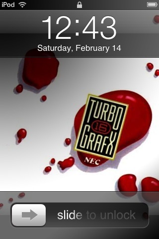
I wanted the iPhone wallpaper to capture the spirit of the original four-page ad, where readers flipped through two mysterious, blood-splattered pages before discovering it was part of an advertisement for Splatterhouse. I actually had a difficult time trying to devise the best constellation of blood spatters. I kept changing and re-arranging the spatters. Here are screenshots of the wallpaper with the mp3 player controls and the basic date display:

Of course, if you want to find out more about Splatterhouse for TurboGrafx-16, you should definitely read the Splatterhouse-centric TurboPlay #2 from August/September of 1990. Lots of neat stuff is in there. For starters, you will discover that the macabre Splatterhouse ad shared pages with wholesome hints for Bonk's Adventure (one of the most family-friendly titles on TG-16).
▲
Return to top of page…