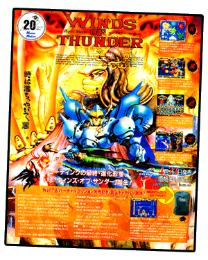
The Japanese advertisement for Winds of Thunder seems a bit too cluttered (especially compared to its North American counterpart), representing one of the few times that American TG-16 fans didn't get shat upon. The sparse, white layout for Lords of Thunder is clean and refreshing when compared to the cluttered text and images smothering Winds of Thunder. TTi even chose a superior title for the game…


BEAUTY & THE BEAST: The original artwork in the Japanese ad is simply gorgeous. Keen observers may have noticed some blood splattered on the sword—look closely…

SIGNED & DATED: 1992.9.16. Masamune Shirow.
FINAL VERDICT: Winds of Thunder wins, clutter and all. Why? Shirow conveys the quiet intensity of a warrior-philosopher; TTi conveys the stoic stupor of thug. In typical North American fashion, Landis has spent too much time in the gym dead lifting his own weight in protein powder. TTi's advertisement is not horrible, but its rendering of Landis's face, body armor and sword fails to capture the grace of Masamune Shirow's original. Maybe TG-16 fans were shat upon, after all…
Continued below…
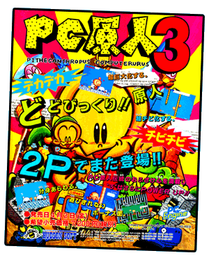
With my earlier criticism of the cluttered
Winds of Thunder advertisement, you might expect me to have harsh words for the
PC Genjin coverart/advertisements. However, I have nothing but praise for the
PC Genjin art. Indeed, the mixed-media design of all three PC Genjin (Bonk) titles—including the third installment advertised here—remains remarkably fresh, fun and creative more than two decades later…

Detail: …
…
▲
Return to top of page…